Back to the shelf

007

Venus Design Story

The design story behind five lines of Venus Remedies corporate stationery, made visible on the web.

Launched · Started August 2025 · Web App · Vibe-Coded

That's the whole thing.

The site's sound is off. The narration still plays.

This reading didn't load. The transcript is below.

Read the transcript

Corporate stationery does not look like design work. It looks like paper. But every colour choice, every typeface, every proportion carries a decision. At Venus Remedies, a pharma company, the stationery runs in five signature lines, from executive notebooks to welcome kits. I wanted to show the thinking behind it.

This walks you through each piece: the colour palette, the typography, how every decision connects to the company's brand identity. Rich visuals carry the story. Small, careful animations hold it together.

August twenty twenty-five. One of the earliest things on my shelf. Built in HTML, CSS, JavaScript, and GSAP. Accessible to the WCAG AA standard, scored against CLEAR, my own review framework.

It's launched. The invisible parts of design are worth seeing.

Narrated in my own cloned voice, generated with ElevenLabs v4.

Corporate stationery looks like paper. It’s actually a set of decisions: about colour, type, and what the brand wants to say before anyone reads a word. Venus Design Story is an interactive web piece that makes those decisions visible.

Venus Remedies has five signature lines of stationery, from executive notebooks to welcome kits. I didn’t design the stationery. I wanted to show the thinking behind it: the care and intention that usually stay invisible.

The piece walks you through each line one at a time. For each one, you see the colour palette choices, the typography decisions, and how they tie back to the company’s brand identity. Rich visuals accompany every step. Careful micro-interactions give it a rhythm you feel as much as follow.

I built it in HTML, CSS, JavaScript and GSAP. It meets WCAG AA accessibility standards and scored 46 out of 50 on my own CLEAR review framework. I vibe-coded it with AI, starting in August 2025. It’s one of the earliest things on my product shelf, and it’s launched.

The making

  • HTML
  • CSS
  • JavaScript
  • GSAP

01 · The problem

Before it existed

What hurt

Corporate stationery looks like paper. The decisions behind its colour, type and wording stay invisible to the people who use it.

Who uses it

  • Designers briefed to make it
  • Leadership stakeholders
  • Employees who receive it
  • 46/50CLEAR review score
  • 5stationery lines
  • 6commits, all in one day
  • AAaccessibility target

02 · The flow

6 steps, in the order they happen

  1. 01 / 06

    Meet the hero

    You
    Opens the page, sees Discover our legacy
    It answers
    Floats Venus-coloured shapes that follow the pointer
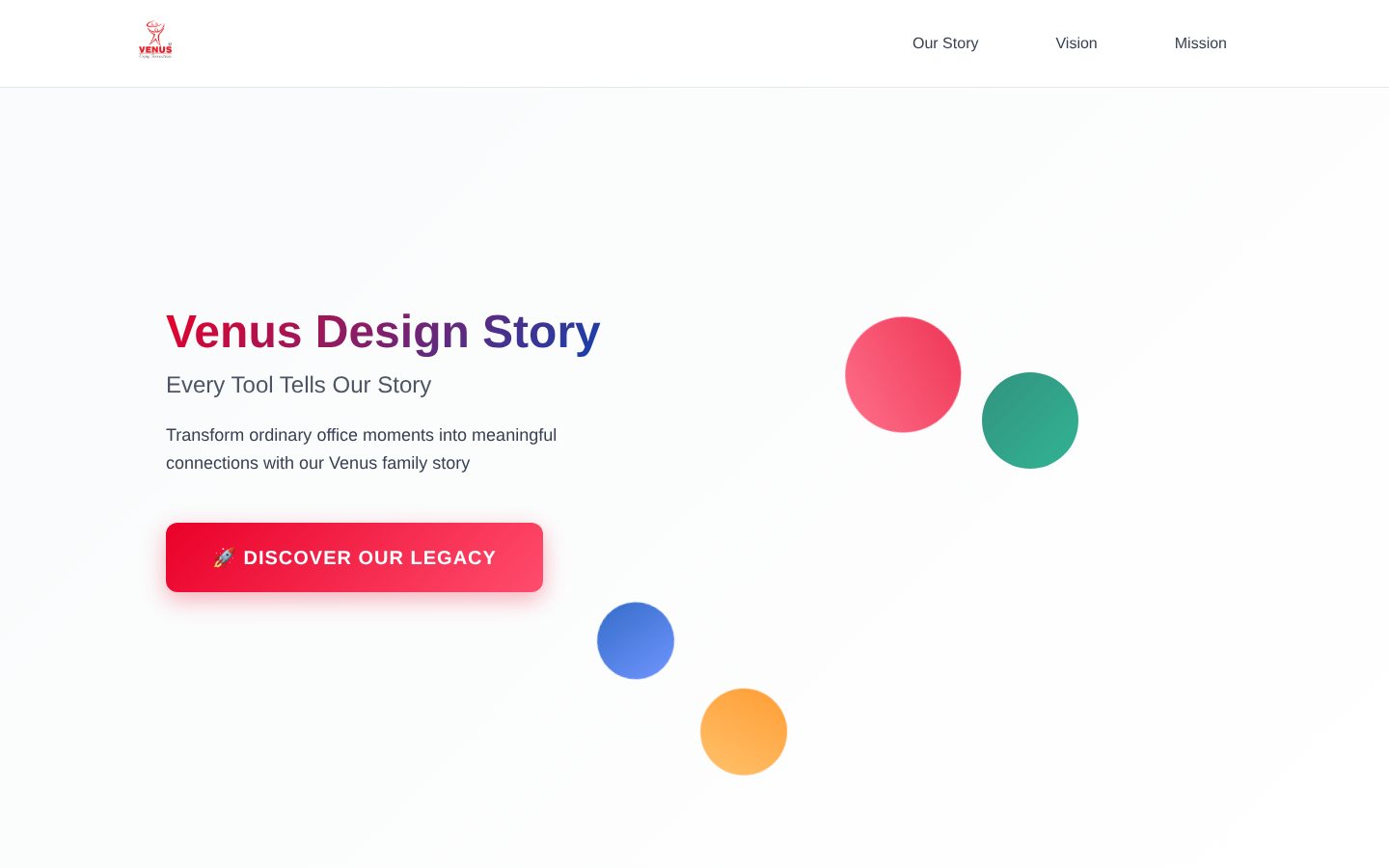
    The Venus Design Story hero with a gradient title and four floating colour discs
  2. 02 / 06

    See the five lines

    You
    Scrolls to the story
    It answers
    Lists five stationery lines and four foundations: heritage, innovation, family, future
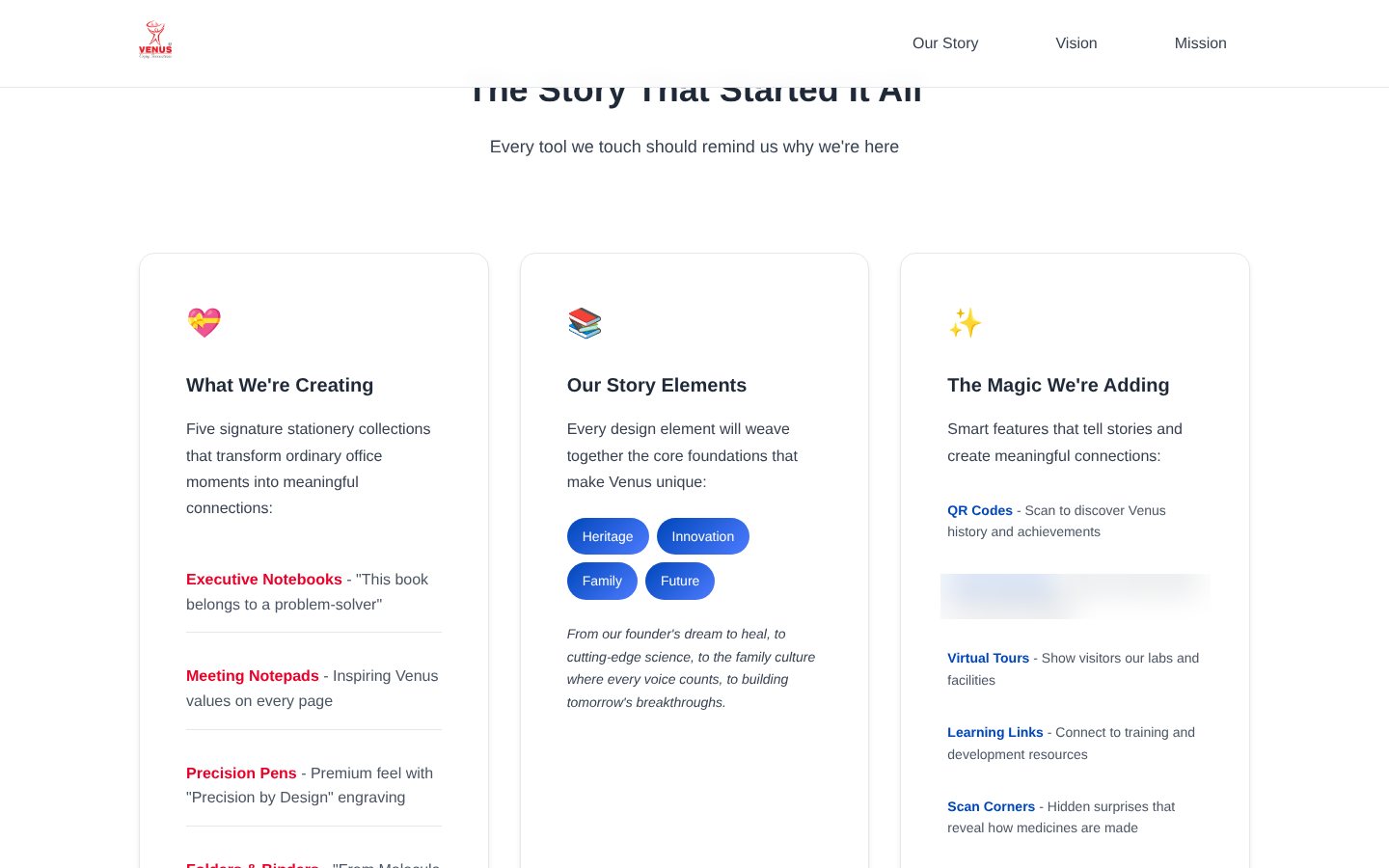
    Three story cards: what is being created, story elements and smart features
  3. 03 / 06

    Read the vision

    You
    Opens a benefit card
    It answers
    Expands pride, connection, inspiration or belonging; Escape closes it
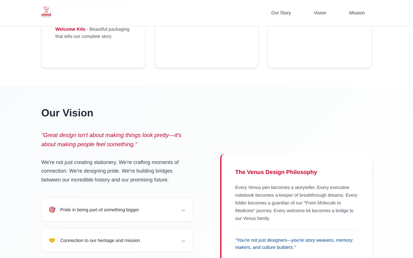
    The vision section with a pull quote and a design philosophy card
  4. 04 / 06

    Follow the designer’s brief

    You
    Steps through three phases
    It answers
    Sets listening, making and bringing to life across eight weeks
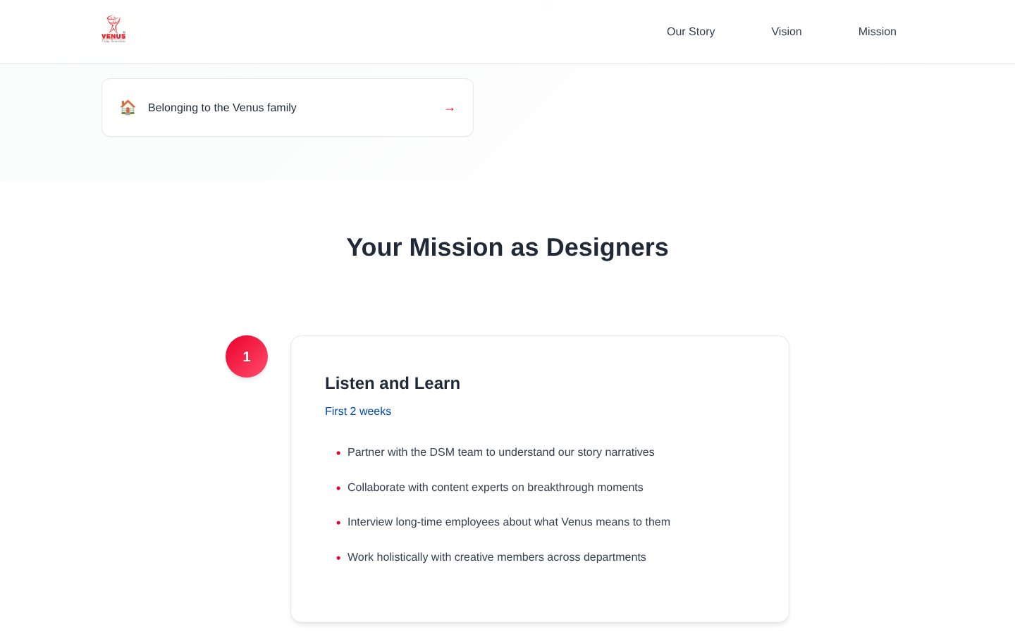
    The first of three numbered phases, Listen and Learn
  5. 05 / 06

    See what success looks like

    You
    Reads the success panel
    It answers
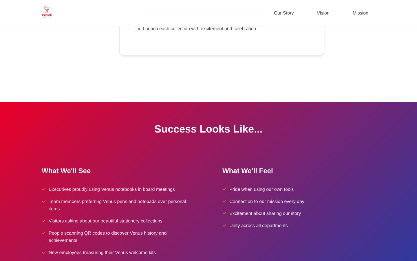
    Pairs what people will see with what they will feel
    A gradient panel titled Success Looks Like with two checklists
  6. 06 / 06

    Begin creating

    You
    Taps Let’s Begin Creating
    It answers
    Answers with a spotlight button and a closing promise

03 · What was special

What it stands on

  1. Scored, then fixed

    A CLEAR review lifted accessibility and reward from 6 to 9 out of 10 and emphasis from 7 to 10. The final score was 46 of 50.

  2. Built for every keyboard

    Skip link, full keyboard use, ARIA labels, and touch targets of 56 pixels or more on mobile.

  3. Small rewards for reading

    Scroll progress, success toasts, and click particles mark progress; animations adapt to the device.

The decisions on paper, made visible on screen.

Making-Of

Five lines of stationery, told as a story people can scroll.

The first commit

  1. The world before

    The pharma company I work with planned five signature stationery lines. The thinking behind them lived in a brief, out of sight of the people who would use them.

  2. One day

    1 August 2025. The first commit and five ‘Ready for live’ commits landed the same day: page, stylesheet, script and logos.

  3. Because of that

    1. A CLEAR review raised accessibility from 6 to 9 out of 10 (1 August).
    2. A skip link, keyboard support and ARIA roles were added (1 August).
    3. Success toasts, click particles and progress tracking became small rewards (1 August).
    4. The primary button got a spotlight treatment (1 August).
  4. Until finally

    It scored 46 out of 50 and was marked CLEAR certified.

  5. Since then

    The repository holds no later commits.

The evidence Process, hands, and artifacts

Process

  1. Origin

    First commit: page, stylesheet, script and logos

  2. Review

    Scored against CLEAR; accessibility, emphasis and reward lifted

  3. Access

    Skip link, keyboard paths and ARIA roles

  4. Reward

    Toasts, particles and progress tracking

  5. Ship

    Marked ready for live at 46 out of 50

Hands

Akshansh

  • Concept and the brand story
  • The CLEAR review and its scoring
  • Sign-off of the page

Agents

  • AI coding assistantWrote the page from his direction; the tool is not named in the repository