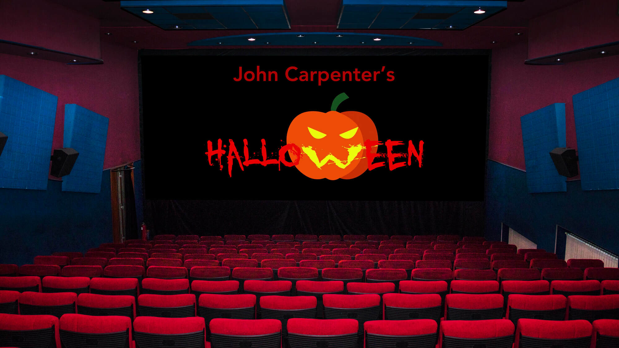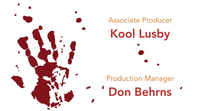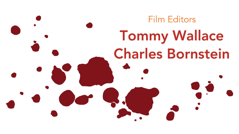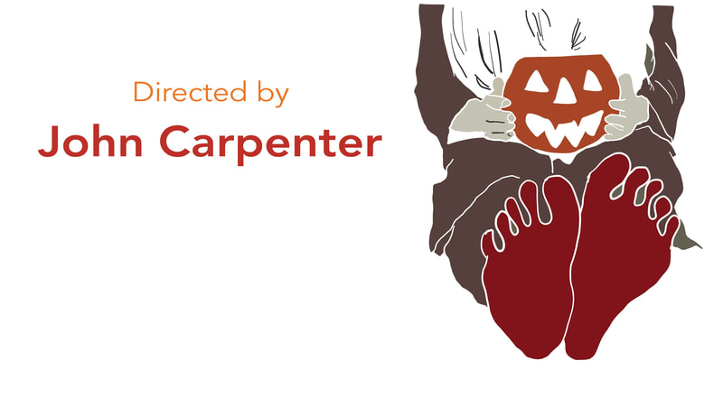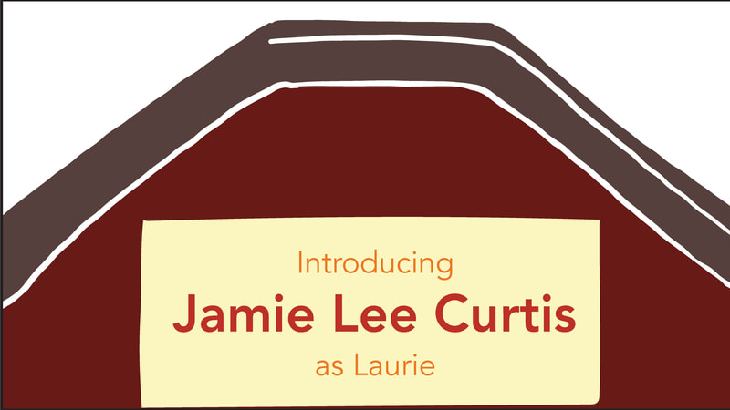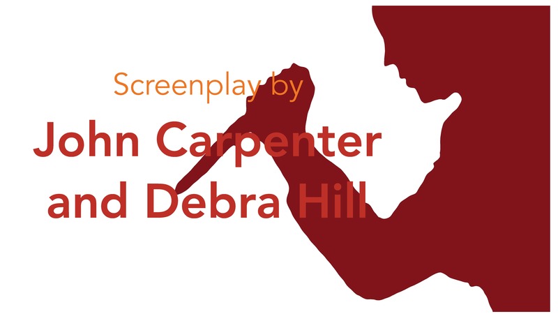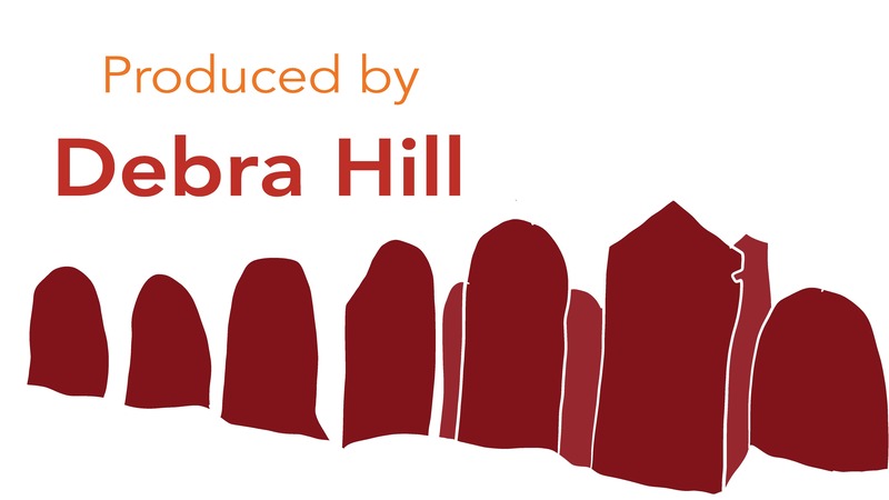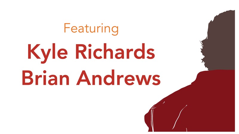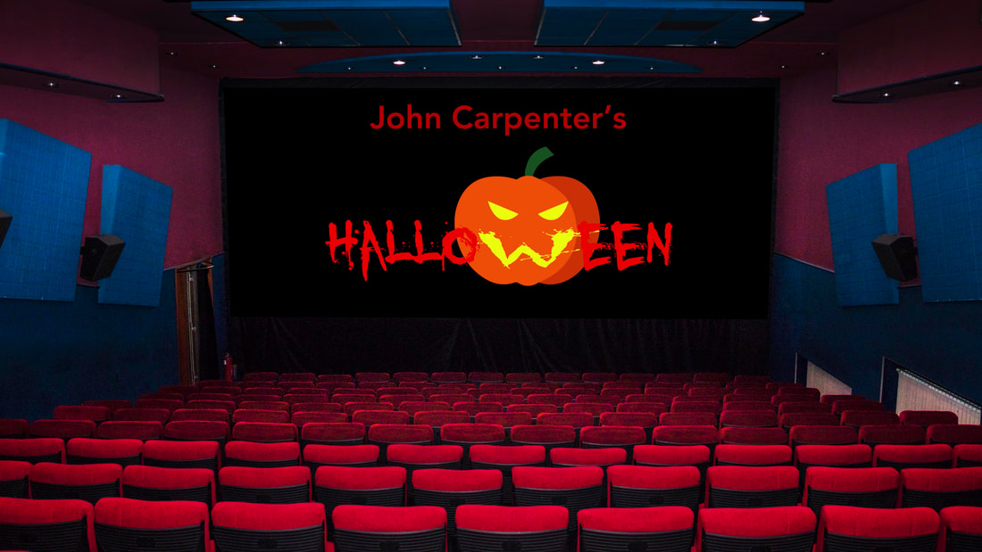
I recreated the title sequence of John Carpenter’s 1978 Halloween using typography alone. No imagery. No montage. Just letterforms, movement, and the original soundtrack.
I made this in 2018 at Parsons. The inspiration came from Saul Bass and Maurice Binder, two designers who set the kinetic, graphic language of the modern film title. I realized, studying their work, that letterforms carry as much tension as any image.
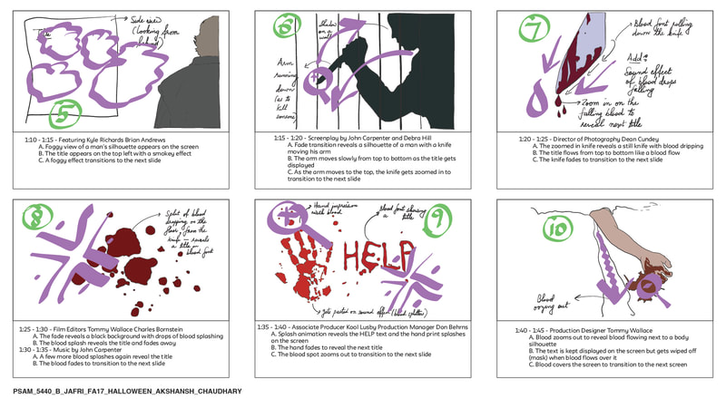
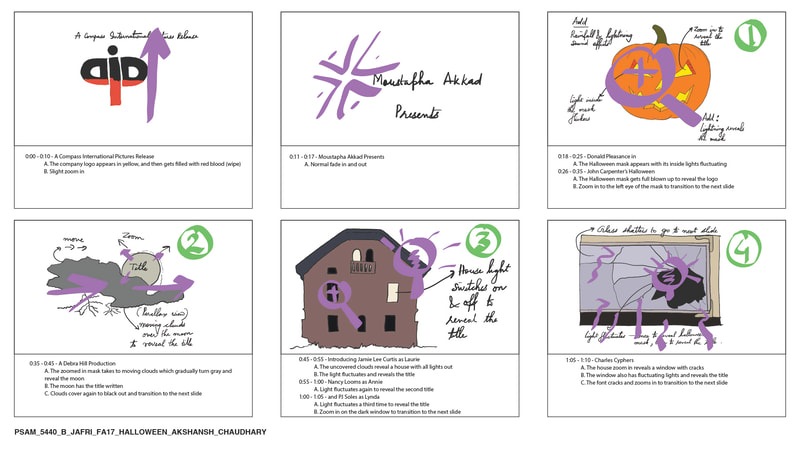
The constraint was absolute: no pictures, no representational content of any kind. Tension, pacing, and dread had to come from the movement and arrangement of type alone. I locked the timing to the music. The score does not accompany the piece, it structures it. Every typographic event follows where the music moves.
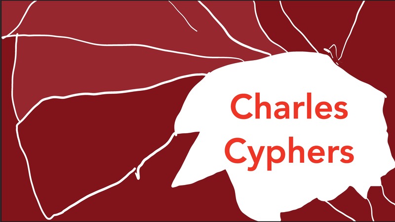
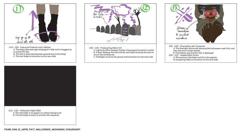
The tools were After Effects, Illustrator, CorelDRAW, and Draw App. The video, storyboards, and individual frames are on this page.
This was homage to classic cinema’s graphic design tradition, made through a purely typographic lens. The project asked what type alone can do to a viewer who already knows what is coming.